Healthy Ride Pittsburgh

Healthy Ride Pittsburgh

Healthy Ride Pittsburgh is a new bike sharing service owned by Pittsburgh Bike Share. A German company, Nextbike, supplies the bikes as well as an app.

Healthy-Ride-Logo (1)

Nextbike_logo_circle

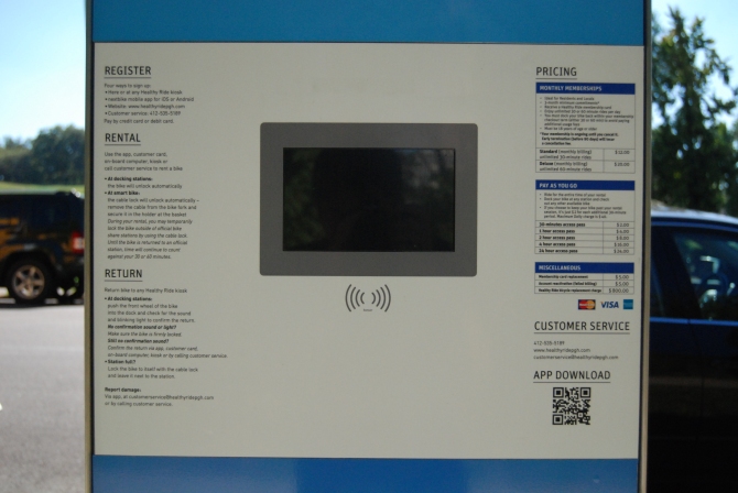
DSC_4252

There are stations in Downtown Pittsburgh, East Liberty, Shadyside, and Oakland.

MapDetailed-Google-LARGE-Noedit

“Nextbike” is the app that can be downloaded in order to rent bikes from a smartphone (apple or android). Using the nextbike app, according to online reviews, is far more simple than trying to use the physical kiosk. This image greets users for one second upon opening the app.

Screenshot_2015-09-22-22-39-13

Google maps and it’s UX is used. Pinch, drag, and other interface controls are the same.

Screenshot_2015-09-24-18-40-41

After tapping on a bike station icon the popup centers on the page and lists the number of bikes at the station as well as when that number was updated.

Screenshot_2015-09-23-11-10-56

A Healthy Ride bike while locked into a bike station.

DSC_4251

By downloading the app, users can bypass using the kiosk. I didn’t ever use the kiosk when testing the system.

DSC_4253

The back of a bike. The number “70309” is the bike’s specific identification number, while the keypad is for using the cable lock.

DSC_4254

After registering a profile, including credit card information, this is the initial home and start screen upon opening next bike.

Screenshot_2015-09-29-01-03-43

Pulling out of bike was easy for me, no technological or mechanical problems. After tapping “Start new rental” the screen jumps to here.

Screenshot_2015-09-23-11-17-38

On the website FAQ, Healthy Ride instructs users to not use the cable locks as the software is faulty, yet, after renting a bike through the app there isn’t any form of notification to warn users. The cable locking device even is the most prominently displayed information on the page, (biggest font, bold) increasing the confusion.

Screen Shot 2015-09-29 at 1.15.04 AM

I didn’t see the warning online, so I tested the lock and didn’t experience any problems. The lock discourages theft as even if a thief cut the thinner bike wire, the solid bolt between the spokes would be much more difficult to remove.

DSC_4274

A closer look at the cable lock keypad.

DSC_4265

While riding the bike:

A user can track their location through an overhead map, but the connection between the physical and digital world isn’t very informative. There are no cues for navigating to a nearby bike station.

Screenshot_2015-09-23-11-34-26

Bikes can be returned by pushing the fork of the bike into any locking mechanism at a station. I held the bike in the station locking dock for a few seconds until the lock activated.

DSC_4277

Online reviews and community feedback.

Yelp reviews were primarily negative, although two people did appreciate the feeling of freedom and joy while riding a bike through the streets. Almost all the complaints were about mechanical or technological issues when using the bikes, bike locks, kiosk number pads, or bike station locking mechanisms.

Screen Shot 2015-09-29 at 12.43.08 AM

Screen Shot 2015-09-29 at 12.43.57 AM

Screen Shot 2015-09-29 at 12.44.37 AM

Members of an online community called the “Voice of the Region” were almost entirely negative, although most of the comments didn’t seem to be specific to Healthy Ride and almost all weren’t actual users of the service.

Screen Shot 2015-09-29 at 12.55.15 AM

Screen Shot 2015-09-29 at 12.48.02 AM

Screen Shot 2015-09-29 at 12.48.28 AM

Reddit users were far more supportive of Healthy Ride and also didn’t have any major complaints about the mechanics of the bike. They also noted the popularity of Healthy Ride throughout Pittsburgh.

Screen Shot 2015-09-29 at 12.45.15 AM

Screen Shot 2015-09-29 at 12.46.55 AM

Screen Shot 2015-09-29 at 12.47.28 AM

Sketchbook Process

I first looked at the boundaries and constraints of the physical and digital environment.

driver-sketch 2

In order to show an overview of the digital and physical environment of Healthy Ride, I created a storyboard that highlighted which parts of an interaction would be considered digital or physical.

driver-sketch 3.3

To further my understanding of the environment, I mapped the digital and physical entrances and exits.

driver-sketch 3.4

I broke down the key variables affecting the system and necessary services required of an average experience using Health Ride. I also recapped my findings from online user reviews.

driver-sketch 4

My personal experience with Healthy Ride was overall positive. The absence of a timer on the bike was worrying as I didn’t want to ride for more than 30 minutes and have to pay another $2. Riding a bike was freeing and I didn’t have any mechanical or digital problems when riding. However, I didn’t navigate to a different bike station or have any time pressure.

driver-sketch 5

I had many new ideas and problems to consider after the in-class critique. The primary questions raised were:

  • What would be considered a successful bike sharing system?
  • How do you navigate while driving?
  • How do you deal with maintaining an even distribution of bikes amongst stations?
  • How can other forms of payment besides credit cards be accepted?
  • How is illegal activity on bikes dealt with?
  • How do you evaluate customer reviews?
  • Do you need a smartphone to us this service?

I answered most of these questions in my sketchbook.

34 1

While continuing to examine nextbike I decided to pretend as if the mechanical components of the bikes, locks, and stations worked perfectly. I hypothesized that users didn’t report having trouble navigating through the environment because they were too busy being frustrated with the physical aspects of the bikes.

34 2

To improve user connection to the digital as well as physical, I added the ability to input a destination into the app.

34

In investigating ways of mounting a phone on a bike I ran into trouble with how to position the phone on the bike as well how to eliminate camera shake. After initially taping a phone to the handlebars, the camera shook violently, forcing me to reevaluate the viability of mounting a phone onto a bike.

34 3

My proposal consisted of creating a navigational app with augmented reality that would complement nextbike.

Proposal Final

https://vimeo.com/143213884

bike logo

In creating an augmented reality navigation system for Healthy Ride I hoped to provide a safer, more fun way to receive directions while biking.

Reflection

Knowledge
What
For A3 I learned about mapping physical and digital spaces together as well as how to use After Effects.
How
In order to explore how the physical and digital environment was composed I used then analyzed the different components of the service, took photos, explored Healthy Ride’s website, and researched customer reviews on multiple websites. To learn After Effects I used lynda.com.
When
All of my project came together in a little over a week. The Wizard of Oz video I created was edited after the due date with in order to more fully represent my idea. I wasn’t able to successfully use After Effects the night before the project.
Regulation
Planning
In completing A3 I believe that I planned well until the last few days before the due date, considering I only gave myself a little over a week to work. I spread out my researching and exploration of the environment over several days, but didn’t shoot my video for the final presentation until the last day. Then, I didn’t seek out the After Effects help I needed, instead trying to figure out how to render on my own.
Assessing
I had to re-assesse many of my design ideas for how to mount a phone on a bike. There were many issues such as video stability and video angle that I didn’t consider until I actually tried taping a phone to the handlebars. Furthermore I had to change my focus of the project, ignoring user complaints about mechanical problems, working instead on digital and physical space interaction.
Experience
Emotions
I felt content with my work until the day before the project was due, when I felt stressed and frustrated. Most of my anger was directed towards After Effects, but after sleeping solidly the day after I felt excited about learning how to use After Effects.
Distractions
My distractions were learning After Effects and my other environments project. I got caught up trying to learn how to use motion tracking when in reality I only needed to place arrows onto the screen at different times. Also, I didn’t invest any time in A3 because I was busy thinking about other environments projects.
Motivation
I became motivated during the beginning of the project when analyzing the environment and kept my motivation throughout the project. However, I was demotivated while first trying to learn After Effects and when I researched navigational augmented reality, which was already “old” technology by now.
What were you challenged by?
I was challenged by the time crunch of understanding a space then proposing a meaningful change within it.  Figuring out how defined a design proposal should be was another challenge I had trouble with. I wasn’t sure how many details or steps to show as far as final wireframes and storyboards.
What did you do well?
I was proud of the depth of my exploration for the current system in place as well as the final video I created.
What would you do differently?
I should’ve done a brief study of the environment before the week the project was due. This would’ve at least started the thinking process for how to improve the environment. Next, after shooting video, I didn’t immediately check my footage to ensure quality. Thus I had to return in the morning to retake video which wasted time. Finally, for my last deliverable, I will learn how to render my final before the last day as attempting to learn technology the night of the due date hasn’t worked for me in the past.

Library Anaylsis

I chose to analyze the Carnegie Library for this project. It’s an amazing space laid out in an amazing building. In the simplest terms, I see it as one big environment that houses many small environments, and all the environments found there are different types of quiet environments. I didn’t realize that there could be so many different types of quiet environments, but when you focus on different users and different contexts, quiet is only one variable among many that you have to design for.

It is evident that the environment was created with the user in mind because immediately I noticed that the majority and most commonly used resources could be found on the first floor. Universal accessibility is extremely important in a public space because its extremely hard to predict what the capabilities of your user will be. By putting the most popular resources on the first floor, the library becomes much more welcoming and easier to use.

The Carnegie Library really is an amazing combination of historical architecture and twenty-first century technology and design. There is such a sense of openness and exploration. I really enjoyed exploring the mezzanine because it gave me a sense of adventure. The library is supposed to be a very tame and regulated place, but the amount of learning and exploration is incredible. There are an infinite amount of resources for people to use. Just few examples are:

  • fiction
  • non-fiction
  • magazines
  • newspapers
  • comic books
  • manga
  • microfilm
  • poetry

I was really amazed at the wealth of resources that were in the library. It goes beyond the books to classrooms and creative spaces where anyone can grow if they choose to participate.

The layout of the library is focusing on the wide variety of users and understands that users have an infinite number of preferences. People work differently, have different interests, sit differently, read differently, learn differently, etc. The Carnegie Library is really successful in accommodating for all types of people.

Photos of some of the environments

Main Floor

IMG_5414

Teen Section

IMG_5415

Work stations and gateway to magazine area and outdoor patio

IMG_5416

Outdoor patio view from inside

IMG_5417

Magazine section

IMG_5418

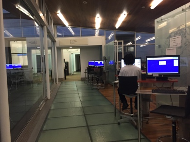
Quiet study room, second floor

IMG_5399

Audio and Media Room, second floor

IMG_5396

Class room in use

IMG_5402

Silent reading and international poetry room

IMG_5401

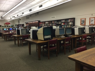
Microfilm and geneaology, third floor

IMG_5405

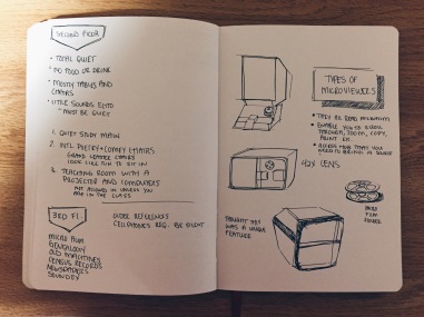
Sketchbook Notes

Processed with VSCOcam with hb1 preset

Processed with VSCOcam with hb1 preset

Processed with VSCOcam with hb1 preset

Mobile Interface

The library doesn’t have its own mobile application, but they are registered on an application called Access My Library (AML). You can do a general search, a database search, and an eBook search. However, there is zero reference to any context or the library environment. This digital environment is completely isolated and has minimal connection to the physical environment.

IMG_5490    IMG_5491    IMG_5492 IMG_5493

Online Interface

What I said concerning the mobile application can also be said for the online website. It feels very disconnected to the actual library. There are many public libraries in Pittsburgh affiliated with the Carnegie Library, and the website addresses them as a general entity. There is some reference to what you can generally find at the library and what events are happening, but this digital environment is mainly concerned with what information is available to the user instantly on the internet.

Screen Shot 2015-09-28 at 10.26.39 PM

Screen Shot 2015-09-29 at 12.04.27 AM

Screen Shot 2015-09-28 at 10.26.55 PM

Floor maps and a ‘virtual’ tour (photos with descriptions)  of the library are the only pieces that refer to the physical environment.

Screen Shot 2015-09-28 at 10.31.00 PMScreen Shot 2015-09-28 at 10.31.12 PM

There really is no hybrid environment that is happening between the library, the website and the mobile application.

What I really want to focus on are the different types of learning environments in the library. All the digital environments mainly reference the resources and information that the library contains; however, the different physical environments are not an area of focus. My initial idea is to publish online an archive and analysis of all the different environments housed in the library. This way, people know what kind of places there are to sit and work in, and hopefully, they will be more inclined to visit.

Studio Redesign reflection

Green Heat:
I wanted to improve studio by catering individually to each user’s heating needs in order to save energy.
logo
    What
This project I learned how to use sketchup and how to “wizard of oz” demos. I also fully realized the importance of documentation/aesthetic quality of a final project.
    How
I used simple drawing as well as software such as sketchup and adobe premiere. I learned sketchup and adobe premiere effects through inclass instruction as well as online tutorials. The significance of final documentation was learned through videos shown in class and comparing my work with my classmates.
    When
I learned sketchup and adobe premiere effects within the two week period of the project.
    Planning
I didn’t plan far enough in advance for this project. Too much time went into worrying about how exact the sketchup recreation of the studio needed to be.
    Assessing
I didn’t personally assess my own work enough, but I did get a fair amount of critique from my peers. The critiques helped open my mind to different aspects of my initial idea. I did assess the validity of the in-class critiques in order to further my understanding on my idea as well as to see which critiques were worth pursuing.
    Emotions
In the beginning of the project I felt a sense of futility, but I began to regain my optimism by the end of the project. The feelings of futility were based in my initial interpretation towards the task of “improving the studio”. I personally have great appreciation for the current studio environment as few other majors have dedicated workspace for their use. My optimism and enthusiasm towards the project was increased after I switched my focus towards promoting green activity in the studio.
    Distractions
Work in other classes began to pick up, but for the most part I procrastinated because I didn’t feel too excited about the project.
    Motivation
When starting this project I had reduced motivation, as I was still feeling a little bit stressed about the ending of the last project. My motivation picked up towards the end of the project, but I wasn’t as motivated as I was for A1.
    What were you challenged by?
I struggled to find a sense of meaning in the project as well as to find an effective way to demo my idea. When hearing about others’ ideas as well as considering my own I would ask myself, “do I really need this”?. The truth was that most of the technology was unnecessary. I had trouble creating green technology that was reasonably grounded in reality as well as finding effective ways to demo it.
    What did you do well?
I had pride in my attempt to save energy in a significant way, as I researched many different methods of saving electricity and focused on some of the most impactful ways.
    What would you do differently?
I definitely need to start out projects with more enthusiasm than I did with A2. With enthusiasm I can shape a project towards what I want to do, starting without energy only stalled my progress. Also my process work was lacking in this project, too few options and ideas were covered in my sketchbook. Finally, I will seek out more feedback on my work throughout the project. Multiple critiques will keep me motivated as well as make sure I’m not straying off my main idea or losing a sense of reality or imagination.

Reflection 9.24

I was really excited that I got my demo to work (at a point).  Working with the technology was extremely challenging and had me second guessing the value of my project. It took while to get around all the SmartThings and IFTTT bugs, but the success definitely was an exciting moment. I can see the potential for these applications; however, there are a lot of gaps between the software and the user. SmartThings cannot accommodate for more than three people when a lot of families are larger than three. It also was not successful at pin pointing a location. Our studio space was obviously not within their problem space, but I uncovered so many issues in my exploration.

For A2, I learned that I do not want to work with SmartThings unless their interface and/or technology improves. I understand that a big part of technology is working around all the obstacles and bugs in order to get the result that you want, but is that really a good system? I feel like the world doesn’t have to be so finicky and sensitive.

I’m not sure I like working with mobile applications. I understand and accept that mobile phones are a permanent part of our society, but I think that as designers we can push the world so much further. Why can’t our spaces communicate well enough so that we don’t need to refer to our phones? And what happened to actually communicating with our friends and peers? Everyone just becomes distracted and absorbed in their devices. I really hope that I can get more experience with designing the environment of real spaces. I want to understand more about the traditional principles of how people move through space. Anyways, how can we move forward if we do not understand where we came from?

I continued to see how documentation can be imperative in the credibility of your work. I need a video to illustrate exactly what is going on even if the reality is slightly different; my concept and narrative need to be communicated because they speak greater volumes about the value behind the project and even who I am as a designer. The technology can always be improved or fixed, but the process behind that mechanical system is a lot harder to see and understand. However, that is the most important when connecting with a client or an audience.

I’m not really sure where I would like my idea to go for A4. I think conservation of energy through the monitoring of presence is a great concept, but I am also inspired by a lot of the work done by my peers.

Now I am focused on my analysis of the Carnegie Library. I am really excited to look at all the different environments that exist within it. There are so many resources inside, and the layout is very intentional and considers all the possible users. I want to go from big to small, from the large, airy rooms to the small chairs tucked away in small hiding places. They are all quiet spaces, but I was amazed at how many different quiet spaces they had created.

Demo and Studio Re-Design Improvment

Demo

Video

For my last demo, I tried to use just iOS location and SmartThings switches. It was unsuccessful, but I really wanted to have a working proof of concept. To get around the technical difficulties, I used a motion sensor and switch and linked the two SmartThings products together in IFTTT. The motion sensor under the desk worked; I taped it underneath my desk just beyond where my chair reaches. Then I used the SmartThings power switch to connect to the power cord. Finally I created a recipe on IFTTT. Every time the motion sensor detects motion underneath my desk, the power strip will turn on. To complete the narrative, in order to turn the power switch off, I would connect location with the power switch using IFTTT so that every time you exit studio (using iOS locator) the power switch will turn off.

IMG_5467

IMG_5464

IMG_5465

I would hope to expand on my ideas of efficiency and sustainability in studio by taking into consideration the other machines in the room that use electricity. I think that by coordinating the amount of light in studio with the amount of natural light coming in through the windows, we can conserve a great deal of energy. Lighting in studio is extremely important and should be a major variable in the design of the space.

Studio Re Design

Going to the Cyert Center for Early Education inspired me to think more about how humans fundamentally learn and what environment is best for people to learn in.

IMG_5463

I really liked the idea of taking advantage of the ceiling space. In freshmen studio, people would hang things and it made the space feel more active and interesting. I also enjoyed all the natural light via skylights. If I could change the windows, I would make them bigger so we could optimize natural light during the day. It would be even better if we could extend the room outwards and include a skylight in that addition.

New Sketch Up Renderings

Screen Shot 2015-09-24 at 4.15.45 AM

Screen Shot 2015-09-24 at 4.16.28 AM

Screen Shot 2015-09-24 at 4.20.50 AM

Ideas for new space

  • Everything on wheels, mobility
  • Chairs fold so that they are easier to move around the room and to store
  • Stackable desks so they move out of the way in a cleaner fashion
  • Transition dividers; digital screens, magnetic, adjustable height. in other words, they can retract and totally disappear or just be lowered a few inches.
  • Two large tables for group collaboration or prototyping that come together to form one large table for class critiques
  • Front wall becomes an interface for screen projections
  • Projector will hang from ceiling
  • Bean bags for more relaxed working, easy to move around or out of the way
  • No wires; lights attached to desk, desk outlets –wired through floor?
  • Hanging apparatus where people can hang anything from projects to plants to other decorations –whimsical aspect, more personal for everyone in the room

I really like the idea of being able to mix and match and customize the furniture in the room depending on the situation, number of people, time of day, etc. There are so many different situations that take place in the room, so the room should be able to adapt based on the needs of the users.

Something I’ve been struggling with…

I really struggled to become passionate about the increased use of technology in studio. At first, it was just frustrating to coordinate all the apps and sensors in the room to work together. I didn’t see this level or system of technology as a viable option for a studio space with multiple users. However, as I think about how to expand on my ideas for efficiency and sustainability, I find myself hesitating to move towards ubiquitous computing. I acknowledge that it is a very exciting world, and I think it is incredible that people have figured out how to make whatever they can imagine a reality. I also understand that a large portion of the world is moving towards this future, but there are still a lot of places in the world that may never (or in the extreme distant future) reach that kind of infrastructure. From my perspective, this is not human centered design, it is closer to what I would call place or group exclusive design. In other words, if we design for one future, are we really thinking about the different ‘presents’ that exist? If we focus on the development of society and infrastructure on one level, I cannot even imagine what kind of impact that would have on places in the world without any sort of (or possibility of) infrastructure for technology. My other concern is that with the influx of technology and its frequent transformations, how can we know what kind of consequences we will have on people? What will ubiquitous computing do to the relationship between humans and the natural world? Will we change human nature? I feel uncomfortable proceeding with ubiquitous technology because I do not feel comfortable venturing into a problem space that is neither defined nor controlled by known factors. The addition of technology for technology’s sake is not what I see as meaningful design.

A2: Studio Redesign

For this project we were tasked with improving the studio space. How we were to design the “studio of the future” was left open-ended.

In this rough storyboard our user enters studio. There are three people in studio already, one standing in front of the fan in order to stay cool.

trial

The user sits down at their desk to begin work.

Screen Shot 2015-09-16 at 11.57.50 PM

However, after a short amount of time the user becomes sleepy and takes a quick nap on their desk. While the user is sleeping the rest of the students leave the studio.

trial2

Since the user was relatively motionless in their chair when sleeping, SmartThings didn’t detect any motion and turned off the lights. The fan has also been turned off.

trial3

The door, originally left open, was shut and locked automatically after 30 minutes after SmartThings didn’t detect any motion.

trial4

After the first crit I decided to go beyond my first iteration and looked through many different changes I could make to studio that I found interesting. Most were about saving energy and didn’t even use any technology.

7

8

I concluded that the two best ways to reduce energy use in the studio was through the lights and heating. I believe these would have the largest “pay-off” in energy saved.

One of the challenges I faced was conflicting information towards how the human body lost heat.

9

My idea for the heating involved shutting off the heating of the overall room entirely, instead catering to each individuals need in the studio. This would save energy as only those present would use enough heat for themselves.

10

Here the user has sat down to work the camera has just finished calibrating. Once the camera calibrates, the fan heater follows the user’s head movement as people will probably take off any scarf or mask that would cover their face. Since that part of their skin is exposed, it will lose heat.

track1

The camera adjusts the heat of the fan by detecting shivers (involuntary movements by humans to stay warm) of the user. This will prevent excessive heating.

track2

The camera detected movement and thus the heat fan adjusted.track3

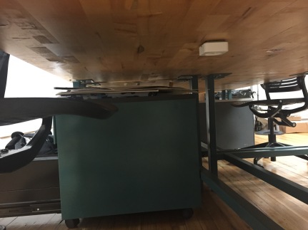
Since the forearms and hands of people may be uncovered in the wintertime even while indoors, body heat would be lost from there. In order to only selectively heat those uncovered body parts, I thought of a tabletop with heating elements underneath and motion sensors on top.

whole desk fin

The motion sensors would detect cold parts of the arm and selectively heat body parts in quantities proportional to how cold they were. In this instance the user’s hand is colder than their forearm.small highlight

My classmates had lots of different questions and critiques for me that I hadn’t considered or had dismissed as irrelevant earlier. Some of the most notable concerns I heard were:

  • Awkwardness and possible discomfort (drying of skin) of a heat fan following around the face of the user
  • How exactly the heating element would be applied to the table, some users wanted to retain the wood tabletop
  • Some users felt cold in their legs and feet, not in their hands, forearms, or head
  • How the app would heat body parts instead of design supplies, possibility of damaging design supplies

10

I worked through most but not all of the issues I was alerted to through feedback. My solutions, illustrated and diagramed below were:

  • For the heating of the head, I didn’t arrive at a solution I was comfortable with. I experimented with an even more awkward device in which a series of heating strips would form a “helmet” of heat around your head and track your movement. The feeling would be akin to the matrix in which a user’s head would become completely immersed with heat and connected to their seat.
  • In defining how the heating elements would be implemented, I settled on the idea of a rigid heating element that could be slid in and out of tables. The heating element would be half an inch below the wood in order to prevent accidental cutting of the element as well as preserve the wooden feel of the desktop.
  • In addition to a slit being cut in the desk, a space underneath the floor could contain another heating element that could track the movement of feet. After further researching body heat, I believe that heating the soles of users’ feet (which are very sensitive to heat) will fool the body into thinking that their legs are warm too.
  • Finally, in order to give more user control I reasoned that an app could be used to control temperature of the heating element, determine which areas to heat or not, and calibrate the heating element to track certain body parts. This app could coincide with IFTTT in that a preset temperature for the heating element could be set based on the current weather conditions.

11

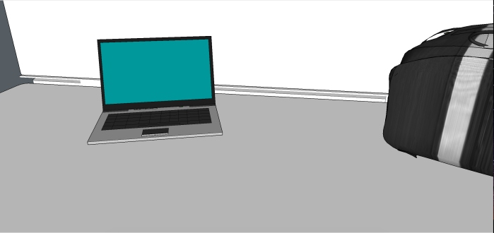
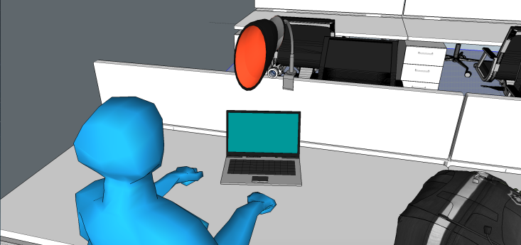
For my demonstration I used the “Wizard of Oz”ing technique in which I added effects to a video. This demo shows the specific heat tracking technology in use. Only the user’s right hand has been calibrated to be heated, thus the rest of the desk or user’s body isn’t heated.

https://youtu.be/Atq1IaqjdgE

logo

I wanted to improve studio by catering individually to each user’s heating needs in order to save energy.

Reflection

What
This project I learned how to use sketchup and how to “wizard of oz” demos. I also fully realized the importance of documentation/aesthetic quality of a final project.
    How
I used simple drawing as well as software such as sketchup and adobe premiere. I learned sketchup and adobe premiere effects through inclass instruction as well as online tutorials. The significance of final documentation was learned through videos shown in class and comparing my work with my classmates.
    When
I learned sketchup and adobe premiere effects within the two week period of the project.
    Planning
I didn’t plan far enough in advance for this project. Too much time went into worrying about how exact the sketchup recreation of the studio needed to be.
    Assessing
I didn’t personally assess my own work enough, but I did get a fair amount of critique from my peers. The critiques helped open my mind to different aspects of my initial idea. I did assess the validity of the in-class critiques in order to further my understanding on my idea as well as to see which critiques were worth pursuing.
    Emotions
In the beginning of the project I felt a sense of futility, but I began to regain my optimism by the end of the project. The feelings of futility were based in my initial interpretation towards the task of “improving the studio”. I personally have great appreciation for the current studio environment as few other majors have dedicated workspace for their use. My optimism and enthusiasm towards the project was increased after I switched my focus towards promoting green activity in the studio.
    Distractions
Work in other classes began to pick up, but for the most part I procrastinated because I didn’t feel too excited about the project.
    Motivation
When starting this project I had reduced motivation, as I was still feeling a little bit stressed about the ending of the last project. My motivation picked up towards the end of the project, but I wasn’t as motivated as I was for A1.
    What were you challenged by?
I struggled to find a sense of meaning in the project as well as to find an effective way to demo my idea. When hearing about others’ ideas as well as considering my own I would ask myself, “do I really need this”?. The truth was that most of the technology was unnecessary. I had trouble creating green technology that was reasonably grounded in reality as well as finding effective ways to demo it.
    What did you do well?
I had pride in my attempt to save energy in a significant way, as I researched many different methods of saving electricity and focused on some of the most impactful ways.
    What would you do differently?
I definitely need to start out projects with more enthusiasm than I did with A2. With enthusiasm I can shape a project towards what I want to do, starting without energy only stalled my progress. Also my process work was lacking in this project, too few options and ideas were covered in my sketchbook. Finally, I will seek out more feedback on my work throughout the project. Multiple critiques will keep me motivated as well as make sure I’m not straying off my main idea or losing a sense of reality or imagination.

Studio Redesign Narrative Exploration

Screen Shot 2015-09-21 at 11.45.15 PM

Presentation of studio redesign:app2

Reflection

For this project I chose to explore the various possibilities of what we can do with the Smartthings app rather than what can we do if we connect Smartthings in IFTTT. Many students in the environments studio, over the past couple of days, have been complaining about the quantity of notifications one receives on their phone after linking the devices in the room to it.

For my exploration I chose to describe a scenario in which a student in environments wants to see if the newly added collaboration area in studio is being occupied. The student is far away from studio and doesn’t want to go in just to find out whether the space is being occupied. Through the Smartthings app the student can see if any devices are connected, view a schedule of who is planning on using the space, or sync their own device remotely if they are running late for a group meeting and want to share their work ahead of time.

I believe that talking in small groups about student work is one of the most effective ways to develop your ideas so I really wanted to incorporate an interactive board, or a Promethian board, into our design space. It can allow students to easily draw over whatever areas they want to edit in their work, share it on a large scale, and therefore develop better working solutions. I also wanted to be able to show the relationship between things going on in studio and things going on outside of studio. I think that this is a good solution because this function is not constantly notifying students about who is hooked up to the board.

Although I think my idea is a good one to work with, I had some trouble deciding how to lay out my story so that it was clear to understand. I experimented with having multiple slides with the same image but shifting your focus to its different features and I think that it was a good way to explain my thought processes. One thing that I’m not happy with is the quality of my photoshopping skills. I need to find ways for my images to become more believable to the viewer so that they can fully immerse themselves in the world I’m trying to create.

Rethinking Studio Redesign and IFTTT

I did another round of brainstorming to start off my process continuation:

Started by looking back at some notes that I took in class

IMG_5378

Then I made a pro and con list of the studio environments and the elements in it. It turned out to be very con heavy…

IMG_5379

IMG_5380

I really believe that if we can make our infrastructure greener at its core, society can easily become more sustainable because normal actions have fewer consequences and a smaller carbon footprint.

So, I wanted to focus on sensors that are connected to the turning on and off of outlets for energy conservation.

I first tried to contain the sequence in the SmartThings application on my phone. In theory, this should work by connecting my phone to the arrival sensor and to the MM211 Power Switch. I got the connection between my phone and the power switch to work. I can successfully turn it on and off while using my mobile device. However, when I tried to configure a series of events (either turning on when I arrived or turning off when I left), it did not work.

SmartThings Interface on iPhone

IMG_5386    IMG_5387    IMG_5388

Peter helped me come up with a solution: use IFTTT to get around some of the bugs in the system. I used iOS locator to track my location and SmartThings to connect to the power switch. The iOS locator was supposed to track when I entered and exited the E Studio and then notify the SmartThings application so that it would turn on or off the power switch. Unfortunately, after lots of trials of walking in and out of the whole building, adjusting the maps, restarting the recipe, etc., I still could not get it to work.

IFTTT Interface on iPhone

IMG_5382    IMG_5385    IMG_5383

IFTTT Interface on Mac Computer

Screen Shot 2015-09-21 at 8.51.48 PM   Screen Shot 2015-09-21 at 8.52.04 PM   Screen Shot 2015-09-21 at 8.52.15 PM

My narrative for this demo can be summarized pretty easily in a few photos:

Enter: On

enter1    sensoronannotated

Exit: Off

exit1    sensoroffannotated

There are a significant amount of flaws with the SmartThings app and the SmartThings sensors. It has a very delayed response time. It also seems to get extremely overwhelmed the more people are connected and using the system. Everyone has become furious with the amount of notifications that it produces. We have definitely reached a threshold with the technology; it is doing much more harm than good. I think I came away with the lesson that too much information can be a bad thing. Sometimes it is better to leave some things to be discovered later.

IMG_5390

notification evidence…

Reflection 9.17

After seeing everyone’s presentations for the studio redesign, I realized that I need to go further into my exploration of the studio environment.  There are a lot of variables at play that I forgot about: traffic flow, energy efficiency, collaborative vs. individual spaces, etc.  I want to go back and take a second look at my original brainstorming; I think I can push my ideas a lot further.  I really want to optimize studio as a working environment but also as a place where collaboration and critiques can take place.  Studio takes on a lot of different roles depending on the day of week and also time of day.  It has to be an adaptive environment that changes to fit the changing needs of the students and teachers.